Son kullanma tarihi geçmiş, bayatlamış bir tarayıcı kullanıyorsanız, Mercedes kullanmak yerine tosbağaya binmek gibi... Web sitelerini düzgün görüntüleyemiyorsanız eh, bi' zahmet tarayıcınızı güncelleyiniz. Modern Web standartlarını karşılayan bir tarayıcı alternatifine göz atın.
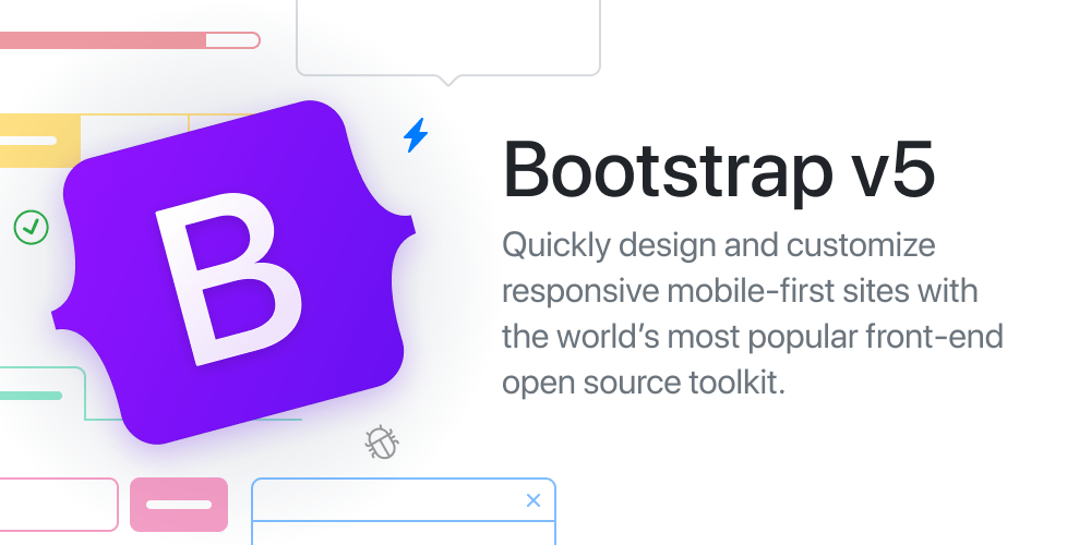
Use our powerful mobile-first flexbox grid to build layouts of all shapes and sizes thanks to a twelve column system, five default responsive tiers, Sass variables and mixins, and dozens of predefined classes.
Learn how to modify columns with a handful of options for alignment, ordering, and offsetting thanks to our flexbox grid system. Plus, see how to use column classes to manage widths of non-grid elements.
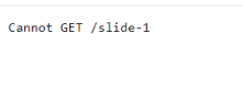
Hocam buna bakabilir misiniz? Başka bir örnekle ilgili slider yaptım fakat ekranın sağ tarafında taşmalar oldu ve alt tarafta da bir scroll açıldı. Bir de sliderlar arası geçiş yapamıyorum. Yardımcı olursanız sevinirim.
Hocam buna bakabilir misiniz? Başka bir örnekle ilgili slider yaptım fakat ekranın sağ tarafında taşmalar oldu ve alt tarafta da bir scroll açıldı. Bir de sliderlar arası geçiş yapamıyorum. Yardımcı olursanız sevinirim.


