Kodları denedim ama ekranda herhangi bir şey çıkmıyor anlamadım tam olarak ne yapmak istiyorsunuz? HTML'de onunla ilgili bir kod yazmadığınızdan emin misiniz? Kendim div oluşturup denedim yine olmadı.Html'e onunla ilgili kod yazmadım.
<!DOCTYPE html>
<html>
<head>
<meta charset="utf-8" />
<meta http-equiv="X-UA-Compatible" content="IE=edge" />
<title>Page Title</title>
<meta name="viewport" content="width=device-width, initial-scale=1" />
<link rel="stylesheet" type="text/css" media="screen" href="main.css" />
</head>
<body>
<h1>HELLO</h1>
<div class="blur">
<div class="wave"></div>
</div>
</body>
</html>
@keyframes gradient {
0% {
background-position: 0% 0%;
}
50% {
background-position: 100% 100%;
}
100% {
background-position: 0% 0%;
}
}
.wave {
background: rgb(255 255 255 / 25%);
border-radius: 1000% 1000% 0 0;
position: fixed;
width: 100%;
height: 12em;
animation: wave 10s -3s linear infinite;
transform: translate3d(0, 0, 0);
opacity: 0.8;
bottom: 0;
left: 0;
z-index: -1;
}
.blur {
position: fixed;
bottom: 0;
left: 0;
width: 200%;
filter: blur(2px);
}
.wave:nth-of-type(2) {
bottom: -1.25em;
animation: wave 18s linear reverse infinite;
opacity: 0.8;
}
.wave:nth-of-type(3) {
bottom: -2.5em;
animation: wave 20s -1s reverse infinite;
opacity: 0.9;
}
@keyframes wave {
2% {
transform: translateX(1);
}
25% {
transform: translateX(-25%);
}
50% {
transform: translateX(-50%);
}
75% {
transform: translateX(-25%);
}
100% {
transform: translateX(1);
}
}
blur(2px)
yazan yere istediğiniz değeri verebilirsiniz.backdrop-filter: blur(5px);
Neresine yazacağım tam olarak ?CSS:backdrop-filter: blur(5px);
Attığı linki inceleyin. Yapamazsanız ekranın şuanki halini ve nereyi bulanıklaştırmak istediğinizide yollayarak yazın. Yardımcı olmaya çalışırım.Neresine yazacağım tam olarak ?
HTML'i de atabilir misiniz?Baktım pek anlamadım. Kodları kendiniz deneyin anlarsınız ne demek istediğimi.
@keyframes gradient {
0% {
background-position: 0% 0%;
}
50% {
background-position: 100% 100%;
}
100% {
background-position: 0% 0%;
}
}
.wave {
background: rgb(255 255 255 / 25%);
border-radius: 1000% 1000% 0 0;
position: fixed;
width: 200%;
height: 12em;
animation: wave 10s -3s linear infinite;
transform: translate3d(0, 0, 0);
opacity: 0.8;
bottom: 0;
left: 0;
z-index: -1;
}
.wave:nth-of-type(2) {
bottom: -1.25em;
animation: wave 18s linear reverse infinite;
opacity: 0.8;
}
.wave:nth-of-type(3) {
bottom: -2.5em;
animation: wave 20s -1s reverse infinite;
opacity: 0.9;
}
@keyframes wave {
2% {
transform: translateX(1);
}
25% {
transform: translateX(-25%);
}
50% {
transform: translateX(-50%);
}
75% {
transform: translateX(-25%);
}
100% {
transform: translateX(1);
}
}
Html'e onunla ilgili kod yazmadım.HTML'i de atabilir misiniz?
Kodları denedim ama ekranda herhangi bir şey çıkmıyor anlamadım tam olarak ne yapmak istiyorsunuz? HTML'de onunla ilgili bir kod yazmadığınızdan emin misiniz? Kendim div oluşturup denedim yine olmadı.Html'e onunla ilgili kod yazmadım.
<!DOCTYPE html>
<html>
<head>
<meta charset="utf-8" />
<meta http-equiv="X-UA-Compatible" content="IE=edge" />
<title>Page Title</title>
<meta name="viewport" content="width=device-width, initial-scale=1" />
<link rel="stylesheet" type="text/css" media="screen" href="main.css" />
</head>
<body>
<h1>HELLO</h1>
<div class="blur">
<div class="wave"></div>
</div>
</body>
</html>
@keyframes gradient {
0% {
background-position: 0% 0%;
}
50% {
background-position: 100% 100%;
}
100% {
background-position: 0% 0%;
}
}
.wave {
background: rgb(255 255 255 / 25%);
border-radius: 1000% 1000% 0 0;
position: fixed;
width: 100%;
height: 12em;
animation: wave 10s -3s linear infinite;
transform: translate3d(0, 0, 0);
opacity: 0.8;
bottom: 0;
left: 0;
z-index: -1;
}
.blur {
position: fixed;
bottom: 0;
left: 0;
width: 200%;
filter: blur(2px);
}
.wave:nth-of-type(2) {
bottom: -1.25em;
animation: wave 18s linear reverse infinite;
opacity: 0.8;
}
.wave:nth-of-type(3) {
bottom: -2.5em;
animation: wave 20s -1s reverse infinite;
opacity: 0.9;
}
@keyframes wave {
2% {
transform: translateX(1);
}
25% {
transform: translateX(-25%);
}
50% {
transform: translateX(-50%);
}
75% {
transform: translateX(-25%);
}
100% {
transform: translateX(1);
}
}
blur(2px)
yazan yere istediğiniz değeri verebilirsiniz.Oldu hocam sağ olun.Kodları denedim ama ekranda herhangi bir şey çıkmıyor anlamadım tam olarak ne yapmak istiyorsunuz? HTML'de onunla ilgili bir kod yazmadığınızdan emin misiniz? Kendim div oluşturup denedim yine olmadı.
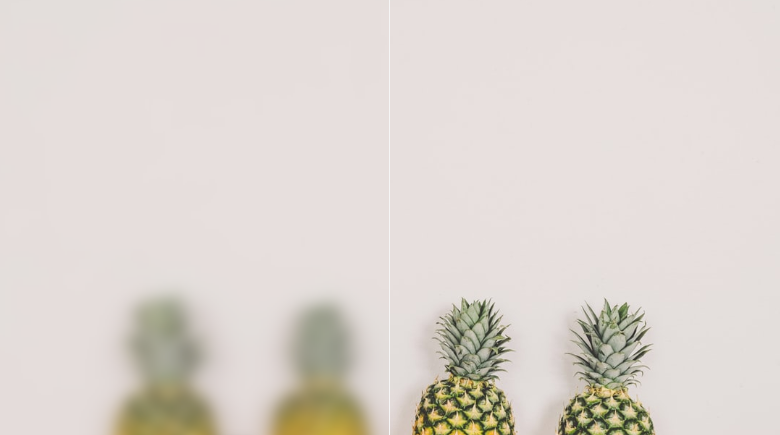
Edit: Tamamdır hallettim. Aşağıdaki dalgayı blurlayacağız değil mi?
HTML:<!DOCTYPE html> <html> <head> <meta charset="utf-8" /> <meta http-equiv="X-UA-Compatible" content="IE=edge" /> <title>Page Title</title> <meta name="viewport" content="width=device-width, initial-scale=1" /> <link rel="stylesheet" type="text/css" media="screen" href="main.css" /> </head> <body> <h1>HELLO</h1> <div class="blur"> <div class="wave"></div> <div class="wave"></div> <div class="wave"></div> </div> </body> </html>
CSS:@keyframes gradient { 0% { background-position: 0% 0%; } 50% { background-position: 100% 100%; } 100% { background-position: 0% 0%; } } .wave { background: rgb(255 255 255 / 25%); border-radius: 1000% 1000% 0 0; position: fixed; width: 100%; height: 12em; animation: wave 10s -3s linear infinite; transform: translate3d(0, 0, 0); opacity: 0.8; bottom: 0; left: 0; z-index: -1; } .blur { position: fixed; bottom: 0; left: 0; width: 200%; filter: blur(2px); } .wave:nth-of-type(2) { bottom: -1.25em; animation: wave 18s linear reverse infinite; opacity: 0.8; } .wave:nth-of-type(3) { bottom: -2.5em; animation: wave 20s -1s reverse infinite; opacity: 0.9; } @keyframes wave { 2% { transform: translateX(1); } 25% { transform: translateX(-25%); } 50% { transform: translateX(-50%); } 75% { transform: translateX(-25%); } 100% { transform: translateX(1); } }
blur(2px)
yazan yere istediğiniz değeri verebilirsiniz.
Bu sitenin çalışmasını sağlamak için gerekli çerezleri ve deneyiminizi iyileştirmek için isteğe bağlı çerezleri kullanıyoruz.